Do you ever face with the request from the customer: I need to see who is in the top and who is in the bottom in the same list? I do. This topic will explain how you can cope with this request.
Data Source
Dashboard is built on the data by Car Insurance Comparison. If you want to pump up as a Tableau expert I strictly recommend you to use the data from Makeovermonday.co.uk/data/ to build interesting visualisations with profound data analysis.
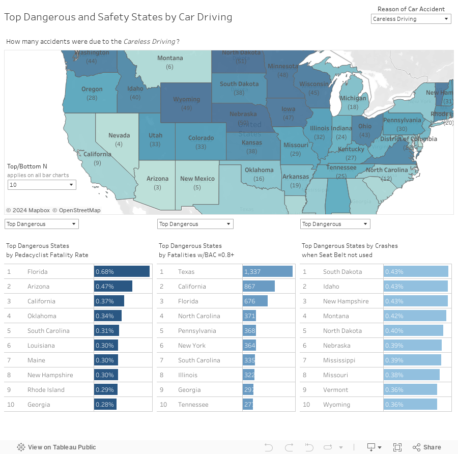
My dashboard shows which States are safety and which are the most dangerous according to the number of car accidents. The final rating is compiled on the basis of several reasons for which a car accident can occur:
- Careless driving
- Drunk driving
- Failure to obey
- Speeding
Map shows how many accidents were in each state depending on the selected type of car accident's reason. Colour code of state indicates number of car accidents in the state. If you hover on any state you can see final score by Dangerous Driving Rating.
In the lower part of dashboard you can see three metrics which indicates Careless driving (Pedacyclist fatality rate,%), Drunk driving (Fatalities w/BAC=0.8+) and Failure to obey (Crashes when seat belt not used,%). These charts shows by default top 10 dangerous States in terms of car driving. You can easily see top 10 the most safety States by selecting 'Top safety' in the appropriate filter.
This approach allows to place data in a compact format, avoiding to creare a separate chart with Top N and Top Bottom.
How to make dynamic Top ('Top Dangerous') and Bottom ('Top Safety') in the same chart?
Step 1
Before creating a calculated field, let's make a Parameter, that will allow users to quickly toggle between views with different variables. Thus we will make dynamic Top/Bottom number of States depending on the selected parameter value.

Step 2
Create calculated field as demonstrated below.

This calculation allows to rank the data according to the value in chart (in the example 'Pedacyclist Fatality rate' measure value).
Step 3
Create 'Top/Bottom?' calculated field as demonstrated below

Pay attention: Maybe you are wondering why I created a separate Rank calculated field, when I could not create it by writing an Index() in the 'Top/Bottom?' calculation. I have made it because there are many other cases when this calculation will help you too. I will explain different cases in further posts.
Step 4
Put Rank Calculation in the row shelf and select in the Editor of table calculation 'Table Down'. Sort list of States by value (in the example 'Pedacyclist Fatality rate' measure value). Add 'Top/Bottom?' field in the Filters shelf and select Top (Top Dangerous) or Bottom (Top Safety). Add dynamic Title in you chart by adding 'Top/Bottom?' measure value.

The information in the post you posted here is useful because it contains some of the best information available. Thanks for sharing it. Keep up the good work shipment data
ReplyDeleteThis comment has been removed by the author.
ReplyDeletehttps://www.inetsoft.com offers an option to export the report in PDF or XML formats. It is one of the best web based reporting tools which allows you to view the reports in XML format.
ReplyDeleteReaders searching for engaging storytelling will appreciate MyStoryTimes for its combination of global news and personal narratives. Every post is carefully written, informative, and highlights perspectives often overlooked in traditional reporting.
ReplyDeleteFor tech enthusiasts and casual readers alike, GeekAngle provides timely updates on gadgets, gaming, and digital trends. Each article is well-crafted, making complex innovations easier to understand and follow.
ReplyDeleteFor professionals tracking market trends and innovation, WiseStockTech provides timely and trustworthy insights on finance and technology. Each article balances depth and clarity, ensuring readers gain meaningful understanding of global developments.
ReplyDelete